Windows Forms: Custom Controls
So Similar to the Tutorial's Custom Control ...
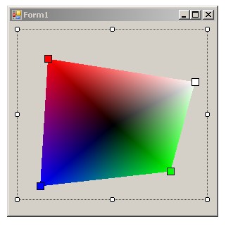
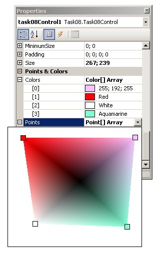
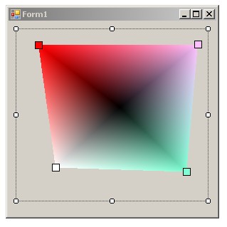
- A custom control displaying 4 points and the gradient between them:
- Points (drawn as small rectangles filled with proper colours, see the picture) define a polygon
- The polygon is filled using the PathGradientBrush
- Colours and positions of points can be changed in the Properties window
- Positions of points can be changed using simple dragging points in the design view of the form
- Implementation details:
- The Custom Control (inherited from the System.Windows.Forms.Control class)
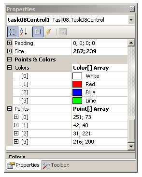
- The control has 2 special properties in a special "Points & Colors" group
(see the picture above)
- Colors - colours of points (of the Color[4] type)
- Points - Point[4] type (see below)
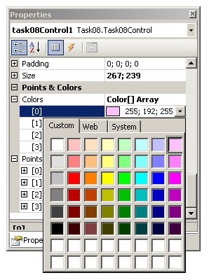
- Points' property editor:
- Use the Editor attribute
- The class of the editor must be inherited from the UITypeEditor class
- Override the following methods:
- EditValue
- GetEditStyle (use the UITypeEditorEditStyle.DropDown style)
- A control used for edition of this property is of the same type as the control being edited
- The user can move points using the mouse
- Create a Windows Forms Application for testing the custom control
- A simple form with one custom control
- Hints:
- The Custom Control:
- Component.DesignMode
- the UITypeEditor class
- the ControlDesigner class
- attributes: Browsable, Category, Editor
- Drawing the gradient:
- PathGradientBrush: SurroundColors
- Graphics: FillRectangle, DrawRectangle
- Approximate points:
- the custom control:
- properties (and their attributes): 1.5
- drawing (the gradient and points): 1.5
- moving points: 1.5
- the testing Windows Forms Application: 1.5
- the editor of the Points property (extending the UITypeEditor class): 1.5
- the control's designer (extending the ControlDesigner class): 2.5